Any identity we create for you should be grounded in reality. You must be able to deliver on your promise.
By David Langton, Langton Cherubino Group
From the swoosh on our running shoes, to the mermaid on our morning cup of joe to companies like Amazon, Oracle and Delphi, mythology is everywhere. Nike the Greek goddess of victory encourages us to banish our fears and "Just do it." The Starbucks mermaid sets us adrift in a sea of caffeinated bliss. All of these logos represent the values of each company and the mythology of their products.
As visual communicators we are often hired to create logos - which from the Greek refers to “meaning” and “logic.” I love the idea that a logo has real meaning. We often tell our clients that any identity we create for you should be grounded in reality. You must be able to deliver on your promise. We can design a great website, but if you don’t provide the services or deliver the research you promise, your company will eventually fail. We can draw beautiful pictures and select gorgeous colors for your brand but if this does not support your mission and connect with your target audience, then it is a waste of resources.
The best logos are practical, they reflect the principles, missions and objectives of services, products, companies and organizations. But what about aspirations? Can a logo express more than concrete reality? If it can embody hopes and dreams as well, is it still a logo? Yes! A logo is a symbol of something and for something.
Karen Armstrong, author of A Short History of Myth, defines “logos” as something that must correspond accurately to objective facts, “It’s the mental activity we use when we want to make things happen... when we organize... it is essentially pragmatic.” She describes “myth” as a way of addressing “what if?” questions. Mythology does not claim to be objective, but offers a way to understand something important, sacred, spiritual, or beyond our rational constructs. A myth offers a truth if it provides a new insight into the deeper meaning of life.
One example Armstrong gives is that our ancestors learned how to hunt, build weapons and organize expeditions using objective skills (logos). Yet learning to deal with the complicated emotions involved in killing animals or getting lost in the jungle or risking one’s life is reconciled in myth.
So how does that apply to the Nike swoosh or the Starbucks mermaid? All of these symbols represent the values and attributes of each company and serve as logos. They also project hope and the promise of the future and serve as myths.
The Renaissance brand
Renaissance Capital is a successful financial research firm in Greenwich, CT. that studies Initial Public Offerings (IPOs) and produces extensive research reports for their clients and subscribers. Their old logo featured an Old English “R” common in the newspaper mastheads like The New York Times. This logo was old, but not from the Renaissance period. My firm was hired to create a new logo and we wanted to know why the company was named “Renaissance.” We were told that the founders wanted to evoke the innovation and entrepreneurial spirit of DaVinci and Michelangelo because they felt that the founders of Google, Ebay and the leading IPOs were the Renaissance people of today. Whew! How do you make a symbol of that? A symbol for that?

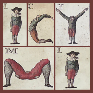
In creating a logo for Renaissance Capital, we had to understand their company name and embody the client’s challenge that the logo had to “say I-P-O.” The logo solution is based on a Greek revival Ionic column motif that is inspired by Renaissance design and literally spells out the letters “I-P-O.” The brand is mythic because it embodies the promise and aspirations of the new Renaissance Capital, it is a logo because it represents a company that delivers real research and useful intelligence on the IPO marketplace.
Can a mythic brand save a company? Enron had an impressive logo but that did not help a company caught in a notorious financial scandal. Legendary designer Saul Bass designed the original globe artwork for the AT&T logo and even though the company failed in the marketplace the brand was purchased by Cingular who renamed itself “the new AT&T” and relaunched the global icon. The AT&T brand was more than a logo. It was bigger than the failed company that it represented, it was a mythic brand.
About the Author
David Langton is a principal of Langton Cherubino Group, a strategic design and interactive communications firm in New York. He can be reached david@langtoncherubino.com or 212-533-2585. Back to Insights


